Ok this week i have created some mood boards to help with my animation ideas. Just by searching google i was able to find many images of example idents. Idents usualy are seen between shows and many broadcast stations go to great lengths to produce them, remember this is the world of advertisement. A way for the station or network to identify themselves.

For this assignment i want to be as creative as possible and delve furthr into the world of 3ds max. So therefore have decided to create a television broadcasting network called "Smash TV" and somehow represent this in 3 different animations. for some extra ideas i searched smash up in a thesaurus and found some more examples of the word smash.

Perheaps one animation could show a car hitting a wall, that would link the smash part, another idea was a TV being smashed or thrown from a window then smash on the floor or show my logo when the TV hits the ground. For the third animation i want to try my hand at character studio in 3ds max, i would like to try to create a low polygon character and then have him move around the stage kicking and punching and maybe at the end smash the camera filming him,

here are some mood boards to help me be more creative:
MoodBoard 1
MoodBoard 2


MoodBoard 3

Week 2 Semester 2

This was the week we learned about constraint paths and a lesson in which i learned a great deal. Constraint paths let you move an object or camera along a path you have already created and it can follow that path in a realistic way. Or it lets an object like an airplane, follow this path banking every turn it must make, which is great for those realistic animations one wants to make.

In the following lesson we made a simple house with various rooms, built a constraint path from a line spline and got a camera to move along it weaving its way through the rooms of the house.

The house was built from walls all the same size, I converted some of the walls into sub object mode and then selected some polygons and just deleted them for the doors and windows.


Lit the areas with a few Omni lights drew a line through the house and lowered that into position.

Created a camera and with that selected went to: Animation, -> constraints, -> constraint path.


You know when you have done it right because the camera suddenly has an attachable line to it just select the line and the camera and line become one. Then we can just set up the timeline and we’re off, my animation was complete.
Here it is below Please take a look and maybe comment?

Week 1, Semester 2 2009

This week we were introduced into the wonderful world of animation, I have been really looking forward to this part. There are various ways to animate in 3ds max and we were shown a few of them in this week’s lesson.

The simplest way is by adding key frames to the timeline at the bottom of the screen and moving your object, this was by far the simplest way to animate but it does have its limitations.

Next we were shown the curve editor, and this part started to get really confusing. Moving your objects along one of the x, y, and z axis is straightforward and simple but ass soon as another axis was added, navigating the curve editor got really hard. And when the last axis was added it took me a while to understand anything that was going on. More tutorials are needed for this part!

The dope sheet is another tool for making alterations in your animation but as my animation was just a ball bouncing around the screen nothing had to be changed here.

Finally we were shown some of the uses of the dummy tool, and how it can be linked to an object so one can move them about. For example if you had many objects together and rotating one of them without clicking on something near by was getting to be a problem, you could just link the object in question with a dummy object, so you can make those final adjustments unhindered. I do think one might be able to move, rotate scale etc multiple objects too so quite a useful tool.
Scene three has been created, here is my scene!


To create the poppies I used the same process that I had used in scene one. Draw a line outline of a petal, then edit the vertices in editable line mode. Once I was happy with the design I extruded the drawing and added a bend to the petal.


I wanted to add more detail to the flower so I created another line drawing this time one of a stamen. Then after modifying it and cleaning up the drawing I lathed it to complete the object.

Then came the very tedious task of placing them all on the center sphere I had made, then I colored them nearly back and the task was complete.

Creating the poppies green leafy base, I cloned one of its petals and modified it, making it bigger and flattened it out.


Then I arranged it in a similar fashion to the petals.

Once all had been arranged my poppy was complete,


Next came the graves and the tombstones. The grave was a cylinder placed in a box and then grouped together, very simple yet effective. As for the tomb I created a flat cube, beveled one of its faces then extruded the object to form another box, then beveled again and extruded once more. I even created one more box on its side then used the pro Boolean subtract mode to create an indent in its side. The cross was made from two rectangular cubes placed on one another.


In Photoshop I was able to edit a few photos of monuments I once took and put them on the objects I have created. This makes the tomb look real-ish and at least the graves now have text on them.

Here’s a church I have made, to build it easily I cut the church up into some shapes. The most time was taken making shapes to pro boolean out the windows in the walls.


Finally I set the stage with my cloned graves the church, a few dead trees that I did not use in scene 2 and my tombstone. I arranged them in a nice order and set up the camera and tried to finalize my scene.

Texturing and lighting in 3ds max is the hardest thing I have yet to master. My textures don’t seem to fit properly and when they do finally, they seem to always have some problem or other. When I try to set the lighting up I to rectify this I thought I would add a fog, that way it would be a lot harder for the viewer to recognize a fault. Or that is what I thought anyway. The fog effect to me hours to correct and I must’ve tried all of the lights in the program to try and get the right one. It has been a horrible nightmare and one that I had to succumb to.
Conclusion

This year’s modeling has been great; I have learnt so much useful tips about 3ds max. I have succeeded in producing some good quality models, including lots of plants and trees, and have had a lot of fun in doing so. Some of my techniques need a lot of practice, but by the time I return next year for my animation part, I think they would be honed quite well.

On a technical level my planning mode is very poor and organizing the objects for the scene with relevant names too, needs a great amount of work, I lack patience and when something goes wrong I am likely to boot the machine. So this year has been quite a mission for me and with a deadline of just 12 weeks it has been a struggle.

That seems to be just about it. My work here is done, have a Happy Christmas
All of you and ill see you all back in the New Year.
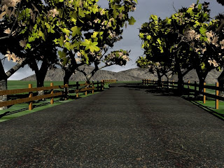
Scene two is finally here!!


Making the scene was pretty straight forward once the trees had been made, the only other objects to be created was the fence, and the land that one can see in the background. The textures I had got from the web in the form of pictures were converted in Photoshop and used in max. I even went walking in the parks where I live to photo trees, leaves, tarmac and wooden fence posts for ideas, some were used too.

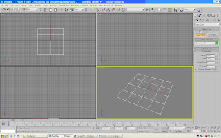
Creating the hills, to start with I chose patch grids from the Create>Geometry. Drop down list and in the top viewport dragged a quad patch to a certain specification like the picture below. A Quad Patch grid is a flat plane that can be modified into 3D surface. Quad Patch refers to patch grid with four vertices.


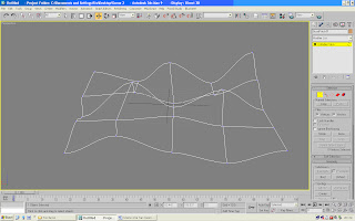
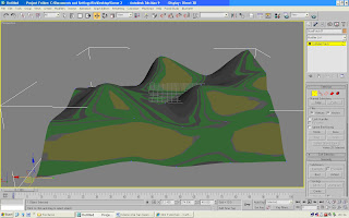
Making sure Quad Patch is still selected I Right click and chose Convert To>Convert To Editable Patch. Then I went to the modify tab, activated Vertex selection. Then, I moved the vertices up and down to create a slope.


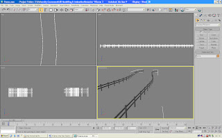
Next came the fence, the fence was very simple too, just made by creating two rectangles of different lengths then cloning them and adding them in a fence like manner, then it was just a job of moving them about and keep cloning them until a very long fence was made. Then I cloned the whole length and put the cloned one parallel.


As for the trees, the tutorial in week 5 explains how I made them; it was then just about time to set the scene up. I had cloned the trees and rotated them to give the illusion that the trees were different. Once the scene was in place I had to create the lighting, this was the most time consuming. I had wanted to add a fog effect to give that September morning feel to the picture but I kept getting a problem with the way light passed through my leaves, because they were not a “real” 3D object and just a texture on an invisible box the volumetric light (in the fog I presume) kept showing the leafs in their true form (not invisible) like the render shown below.


To overcome this problem I dismissed the fog effect and rendered the scene with mental ray and my lighting in the scene was of the same caliber; this made my scene very colorful and added some good quality shadows.
Scene one has been created!!


This scene is a 3D image produced in 3ds max; it has been created for my month March.
The picture depicts a pond with rocks around the edge, a water lily is in the center of the scene and there are daffodils and other yellow flowers in the background. I have added some green plants to fatten out the scene. The main effect was the water which in my option adds a very nice effect to the overall picture. In the next few paragraphs I will try to explain how the image was created.


The daffodil has been created from a line drawing then I lathed it to create a bulb like feature, I had to set the pivot point first to get the lathe I had wanted. Then I edited poly and went about molding the lathed line in to the perfect bulb for my daffodils, as you can see by the result below.


Then I repeat the whole process to make the petals for my flowers and the leaves for their stems only instead of lathe modifier, I use the extrude modifier, this makes my 2d object a 3d one.


Once one petal has been made I use a bend and twist modifier to create the right shape then all that is left is to clone the petal and arrange in nice way. I repeat process for leaves and stem then put all objects together to see how they look.


I repeat the process again for a different kind of flower; I liked the daisy shape so I made one like a daisy. And it was pretty simple to make, so why do anything to complex.


The flowers have been created, we now needed a water lily or two and another flower for that these were easily created too. I created a cylinder and adjusted the slice on it to ten degrees. Then I edited in poly mode and deleted one of its sides added a noise modifier to warp its shape a bit. Mesh smoothed it to add a nice effect and came up with a water lily pad shape. Then cloned the result three times and arranged in a nice way.


To create the lily flower I re-used the daisy petal but instead of arranging petals like daisy arranged them in different way, it worked rather well as you can see.


The palm leaves you can see in my picture, were used to fatten the scene out, they were originally thought up to be ferns but alas something along the way went pear shaped and palms were created. I wanted foliage to fill out the scene but I dint know where to start so I searched Google for planets and tried my hand at creating some. I made a thin plane triangle shape to produce a tip and another rectangular for a leaf and then started to arrange them into a position that looked plant shaped here’s what I came up with.


Having no ideas to reference your object with can cause problems to a beginner, when starting an object just be patient and try to cover all angles. When I persevered it started to take shape so I kept working on it:


Now some rocks were needed for the pond scene so I set about making some. This was a pretty easy object to create, all one needs to do I create a shape like a box, then select its vertices and push and pull it into a required shape. Remember to give your box many segments to have full manipulative control.


Finally for the water effect I followed this tutorial here:

http://storm.prohosting.com/mindcndy/watertutorial.html

Lastly the objects were placed around the water plane the rocks were given a texture. And the camera was placed from the lily’s point of view, this way the scene captures the reflections very well.

So there you have it, one simple scene for March and it contains some of the plant objects I had wanted to do from the start, and a very nice water effect.
Week 5

This week I am starting to model some trees, I have spent many hours browsing the internet looking up tutorials on how to make tree trunks, branches and even leaves.

Many of the ones I have read through teach you the simplest way is to start from scratch and extrude and bevel your way from trunk to tip. One problem I found using this method was that if you didn’t have a picture of something in your head to reference it to, it just seemed to start to get messy as you can see below.


Another tutorial showed how you can draw your trunk and branches in line mode and then convert it all into 3d. This was a very straightforward tutorial to work through and the results were surprisingly rewarding. However I started to expand on my new found knowledge and wanted to create more branches and even some twigs for the branches and creating them this way started to get very complex indeed so some limitations apply.


So I went back to the drawing board and just by using cylinders started drawing my tree from scratch. This was a very simple way of producing a tree and its branches; every cylinder can be moved without messing up any other part of the tree. They can be scaled, rotated moved etc very easily. When I was finally happy with the set up of my tree I started to connect the pieces together. This was a little bit time consuming but I think it was well worth it, as you can see with the following screenshots.


This final image of the trunk and its branches has a mesh smooth modifier just to round off the edges a little bit and has given my tree a cool effect. All it needs now is a realistic bark texture and I can proceed to the next step; its leaves.


Leaves

Now this is proving to be the hardest part of these models and the most time consuming too, I tried making a leaf by drawing a picture of one using the line tool and then extruding it but drawing in max without a pen is pretty difficult, so I dismissed that idea.
So I have discussed this problem with a few other students and found out that all I need to do is make a box as thin as possible and map a leaf texture on to it. So it will give the illusion that the tree has leaves. So quite simply I made it so:

Then it came to the really tedious task of scaling, rotating, moving and cloning the leaf all around my tree and then repeating this task over and over and over again…


Now all I have to do is find some more leaf textures, and make some other trees!